
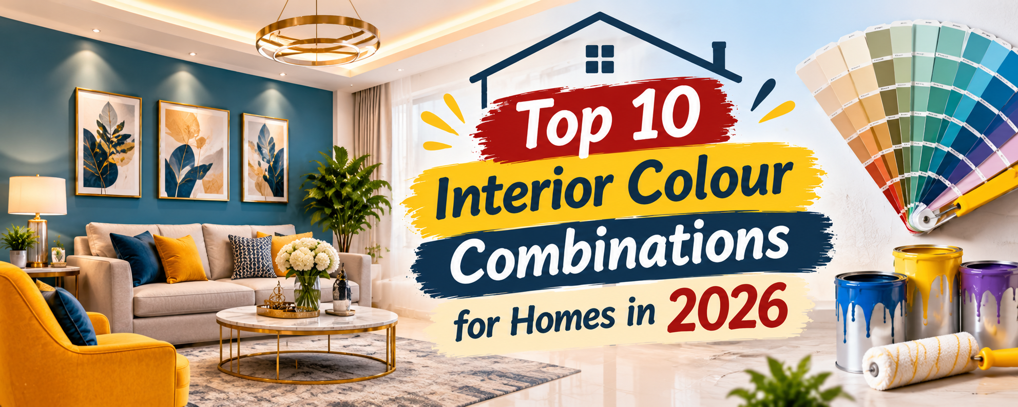

Choosing the right interior colours is one of the most important decisions when designing a residential home. Colours influence how spacious a room feels, how natural light appears and how different furniture and decorative elements come together. A well-planned colour combination can make an ordinary room feel elegant, warm, peaceful or energetic.
However, selecting colours only by looking at small paint samples can lead to disappointing results. The same shade may look different under natural daylight, warm LED lighting and cool artificial light. Wall size, flooring, furniture, curtains and ceiling colours also affect the final appearance.
Here are ten attractive interior colour combinations for modern Indian homes, along with ideas about where to use them and how to balance each palette.
1. Warm White and Natural Wood
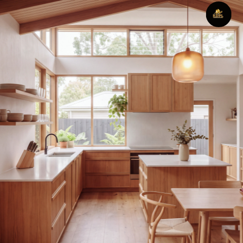
Warm white combined with natural wood creates a welcoming and timeless interior. Unlike stark white, warm white has a softer appearance that works beautifully with wooden furniture, beige curtains and natural textures.
Use warm white on the main walls and introduce wood through TV panels, doors, wardrobes or furniture. A light wooden floor or wooden ceiling detail can make the space feel coordinated.
This combination is particularly suitable for homeowners who prefer a clean interior without making rooms feel cold or empty.
2. Beige and Olive Green
Beige and olive green create a calm, nature-inspired atmosphere. Beige keeps the room visually light, while olive green introduces depth and character.
Use beige for the larger wall surfaces and olive green for one feature wall, upholstered furniture or curtains. Add indoor plants, wooden side tables and warm lighting to complete the look.
Avoid using too much dark green in a small room with limited daylight. A softer olive shade can provide a similar effect without making the space feel heavy.
3. Navy Blue and Soft Grey
Navy blue and soft grey offer a sophisticated combination. The deep blue adds richness, while grey balances the overall appearance.
In a bedroom, use navy blue behind the headboard and soft grey on the remaining walls. White bedding, brushed-metal fittings and subtle warm lighting can enhance the effect.
For a smaller room, use navy blue selectively rather than covering every wall. This keeps the interior elegant without making it visually overwhelming.

4. Sage Green and Cream
Sage green and cream are ideal for homeowners who prefer soft, relaxing colours. Sage green has a muted natural appearance, while cream adds warmth and brightness.
Use sage green on a bedroom feature wall, wardrobe shutters or selected furniture. Cream can be used for the remaining walls, ceiling and curtains.
This palette pairs well with light oak furniture, woven textures and simple decorative accessories. It is also suitable for a guest bedroom where a peaceful and welcoming atmosphere is desirable.
5. Terracotta and Off-White
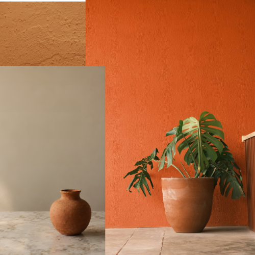
Terracotta and off-white bring an earthy, warm character to residential interiors. The combination works especially well in Indian homes because it complements wood, natural stone, handmade decor and traditional textures.
Use terracotta on a feature wall or through selected decorative surfaces. Keep the other walls off-white to maintain visual balance.
Brass accessories, wooden furniture and textured cushions can add further warmth. If the room is compact, choose a muted terracotta shade rather than a very dark reddish-brown.
6. Charcoal Grey and Mustard Yellow
Charcoal grey and mustard yellow create a bold contrast. Charcoal provides a strong background, while mustard adds energy and brightness.
Use charcoal on a selected wall, TV unit or furniture piece. Introduce mustard through cushions, chairs, lampshades or artwork. Balance the combination with white or light-grey surfaces.
This palette is best used thoughtfully. Covering all walls in charcoal can make a room feel dark, especially when windows are small.
7. Blush Pink and Warm Beige
Blush pink and warm beige create a soft, understated interior. The combination is suitable for homeowners who want a gentle colour palette without relying entirely on white or grey.
Use blush pink on one wall, upholstered headboard or selected wardrobe panels. Warm beige can cover the remaining surfaces and larger furniture pieces.
Light wooden finishes, cream curtains and subtle metallic details work well with this palette. Choose muted pink rather than an overly bright shade for a more timeless appearance.
8. Teal Blue and Light Cream
Teal blue combines the depth of blue with the freshness of green. When paired with light cream, it creates a distinctive yet balanced interior.
Use teal on a feature wall, sofa upholstery or decorative panels. Keep larger wall areas cream to prevent the darker shade from dominating the room.
Wooden furniture, neutral rugs and warm lighting can soften the overall appearance. This combination works particularly well when the home has good natural daylight.
9. Lavender and White
Lavender and white create a light and gentle atmosphere. Lavender introduces colour without being too intense, while white keeps the space fresh.
Use a soft lavender shade on the walls and white for the ceiling, doors or selected furniture. In children’s rooms, the combination can be supported with colourful accessories that are easy to update as the child grows.
Avoid very dark purple tones if the aim is to create a bright, relaxing bedroom.
10. Chocolate Brown and Ivory
Chocolate brown and ivory create a rich, classic interior. The deep brown adds warmth and visual weight, while ivory keeps the room from feeling too dark.
Use chocolate brown for wooden wall panels, furniture, selected wardrobes or a feature surface. Ivory can be used for walls, upholstery and curtains.
Stone-look flooring, warm lighting and carefully selected decorative pieces can make the combination feel premium. In smaller rooms, use brown mainly in furniture and accents rather than on every wall.
How to Choose the Right Colour Combination for Each Room
A colour palette should suit the purpose of the room, not just the latest interior trend.
Living room: Choose welcoming combinations such as warm white with wood, beige with olive or terracotta with off-white.
Master bedroom: Consider calming combinations such as sage green with cream or navy blue with soft grey.
Children’s bedroom: Use light, adaptable shades and introduce stronger colours through accessories.
Kitchen: Light cream, warm white, muted green and natural wood can create a clean and comfortable appearance.
Dining room: Earthy shades, warm neutrals and selected accent colours can create a more intimate setting.
Before finalising paint, test sample patches on the actual walls. Observe them in morning daylight, afternoon light and under the lighting planned for the room. Also coordinate wall colours with flooring, wardrobes, furniture, curtains and ceiling finishes.
Common Mistakes to Avoid When Selecting Interior Colours
One common mistake is choosing too many strong colours in a single room. This can make the interior look visually busy. Another is selecting paint before finalising flooring and large furniture pieces, which may create an unwanted mismatch.
Do not ignore lighting. A colour that looks attractive in a showroom may appear completely different in a room with limited daylight. Similarly, very dark shades on all four walls can make compact rooms feel smaller.
Finally, always check the paint finish. Matte finishes can help reduce visible surface reflections, while washable finishes may be more practical in frequently used areas. Select the product according to the room’s usage and the manufacturer’s recommendations.
Conclusion
The right interior colour combination can transform the atmosphere of a residential home. From warm white and natural wood to chocolate brown and ivory, each palette offers a different character. The most important thing is to match the colours with the room’s size, natural light, furniture and intended use.
Instead of copying a design exactly, use these combinations as starting points and adjust the shades to suit your home’s architecture and personal preferences. A balanced palette, carefully tested paint samples and coordinated finishes will help create an interior that remains attractive and comfortable over time.
Frequently Asked Questions
1. Which colour combination is best for a modern residential home?
Warm white with natural wood, beige with olive green and sage green with cream are versatile choices for modern residential interiors.
2. Which colours make a small room look bigger?
Warm white, ivory, light beige and pale grey can help a room feel brighter and more open, particularly when natural light is available.
3. What are the best colours for a master bedroom?
Sage green with cream, navy blue with soft grey and blush pink with warm beige are attractive options for master bedrooms.
4. Which interior colours are suitable for Indian homes?
Warm neutrals, earthy terracotta, olive green, cream, wooden shades and muted blues work well with many Indian interior styles and materials.
5. Should all rooms in a house have the same colour?
No. You can use a consistent base palette throughout the home while selecting different accent colours according to each room’s purpose.
6. Which colour combination is best for a living room?
Warm white with wood, beige with olive green and terracotta with off-white are welcoming options. The best choice depends on room size, lighting and furniture.
7. How do I choose wall colours to match wooden furniture?
Identify the undertone of the wood. Warm wood generally pairs well with cream, beige and earthy shades, while cooler wood finishes can work with soft grey and muted colours.
8. Which paint finish is best for residential interiors?
Matte and low-sheen finishes are popular for living areas and bedrooms. Washable or more durable finishes can be useful in kitchens, corridors and high-contact areas.
9. How can I test an interior colour before painting the whole room?
Apply sample patches to the actual wall and observe them at different times of the day under natural and artificial lighting. Compare them with your flooring and furniture.
10. Are dark colours suitable for small bedrooms?
Yes, but use them selectively. A dark headboard wall, wardrobe finish or accent feature can add depth without making the entire bedroom feel enclosed.