Your bedroom is more than just a place to rest—it’s your personal escape from the world, where your day begins and ends. The color palette you choose can influence not only the aesthetic appeal but also your mood, emotions, and sleep quality. Colors have psychological effects; they can make a room feel cozy, spacious, lively, or calm.
Choosing the right bedroom color combination can turn a dull space into a serene sanctuary or an inspiring retreat. Whether you prefer modern minimalism, classic elegance, or natural tones, we’ve listed the 10 best color combinations for bedroom interiors that blend design, psychology, and comfort beautifully.
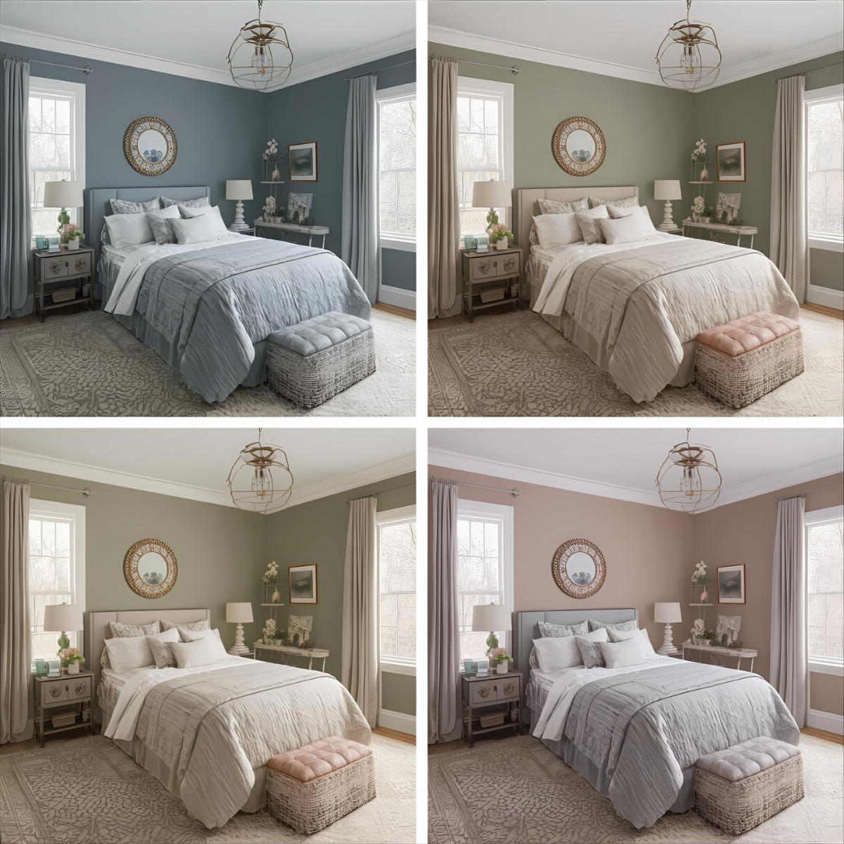
1. Blue and White – Calmness & Serenity
Blue represents tranquility and trust, while white stands for purity and openness. When combined, these colors create an atmosphere that soothes the mind and promotes restful sleep.
Why It’s Preferred:
Blue’s cool tone helps reduce stress and anxiety, while white reflects light, making the room appear bright and spacious.
Benefits:
- Encourages relaxation and mental calm.
- Ideal for small bedrooms as it opens up the space visually.
- Pairs well with wooden or minimalist furniture.
Mood Created: Calm, peaceful, and refreshing.
Pro Tip: Use lighter shades like sky blue with crisp white linens for a soft coastal vibe, or navy blue with matte white for a luxurious hotel-style room.
2. Sage Green and Beige – Nature-Inspired Harmony
This combination brings the serenity of nature indoors. Sage green is a muted, calming color inspired by leaves and herbs, while beige adds warmth and natural softness.
Why It’s Preferred:
It connects your bedroom to the outdoors, promoting balance and positivity.
Benefits:
- Promotes emotional stability and restfulness.
- Complements wooden furniture, indoor plants, and neutral decor.
- Works in both traditional and modern interiors.
Mood Created: Grounded, serene, and organic.
Pro Tip: Add jute rugs, linen curtains, and warm lighting to complete the nature-inspired look.
3. Blush Pink and Grey – Soft Elegance
Blush pink brings tenderness and charm, while grey adds balance and sophistication. Together, they form a subtle yet elegant combination that’s soothing without being overly feminine.
Why It’s Preferred:
It creates a cozy, welcoming vibe with a touch of modern minimalism.
Benefits:
- Encourages emotional calmness and affection.
- Ideal for contemporary and Scandinavian interiors.
- Pairs beautifully with metallics like rose gold or silver.
Mood Created: Romantic, gentle, and refined.
Pro Tip: Use a matte grey wall as the base and accent with blush cushions, throws, or decor pieces for a polished look.
4. Cream and Brown – Timeless Warmth
This classic duo never goes out of style. Cream adds brightness, while brown adds depth and coziness, creating a timeless, comfortable environment.
Why It’s Preferred:
It’s versatile and suits almost every decor theme—rustic, vintage, or modern.
Benefits:
- Promotes relaxation and security.
- Perfect for wooden furniture and natural textures.
- Warm lighting enhances the cozy feel.
Mood Created: Comforting, secure, and homely.
Pro Tip: Try layering textures—like soft cream walls, brown leather chairs, and beige rugs—for a sophisticated yet inviting bedroom.
5. Light Grey and Navy Blue – Sophisticated Calm
Grey and navy blue create a luxurious yet calming ambiance. Navy gives depth, while grey adds neutrality, balancing the overall tone.
Why It’s Preferred:
It’s perfect for those who want a mature, sophisticated bedroom that still feels peaceful.
Benefits:
- Adds a modern and refined aesthetic.
- Encourages focus and emotional balance.
- Pairs beautifully with metallic decor or white trim.
Mood Created: Elegant, composed, and modern.
Pro Tip: Add white or silver accessories to highlight the color contrast without making the space feel heavy.
6. Lavender and White – Peaceful Romance
Lavender, known for its calming properties, promotes relaxation and better sleep. Combined with white, it creates an airy, romantic atmosphere.
Why It’s Preferred:
Lavender is both tranquil and refreshing, while white adds clarity and purity.
Benefits:
- Reduces anxiety and promotes restful sleep.
- Great for small spaces as it reflects light.
- Works beautifully with minimal or vintage interiors.
Mood Created: Peaceful, romantic, and dreamy.
Pro Tip: Pair lavender walls with white bedding and a touch of gold or silver decor for an elegant, spa-like vibe.
7. Terracotta and Off-White – Earthy Warmth
Terracotta adds warmth and creativity, while off-white provides contrast and lightness. This pairing feels grounded, cozy, and naturally inviting.
Why It’s Preferred:
It adds personality without being overpowering, perfect for people who love rustic or bohemian interiors.
Benefits:
- Encourages comfort and grounded energy.
- Enhances the natural light in the room.
- Complements earthy decor like clay pots or cane furniture.
Mood Created: Cozy, creative, and earthy.
Pro Tip: Use off-white for main walls and terracotta for an accent wall to create visual balance.
8. Teal and Mustard Yellow – Vibrant Contrast
Teal represents calmness and creativity, while mustard yellow adds energy and optimism. Together, they create a bold yet balanced color scheme.
Why It’s Preferred:
It’s perfect for artistic personalities who want both energy and depth in their space.
Benefits:
- Inspires creativity and positivity.
- Adds life to modern interiors.
- Works best when one color is dominant and the other is used for accents.
Mood Created: Energetic, inspiring, and bold.
Pro Tip: Try teal walls with mustard cushions or a mustard bed throw to create a pop of personality without overwhelming the room.
9. Charcoal Grey and White – Modern Minimalism
This combination is sleek, timeless, and effortlessly stylish. Charcoal adds sophistication, while white keeps it clean and open.
Why It’s Preferred:
Ideal for modern urban bedrooms where simplicity meets luxury.
Benefits:
- Offers a chic, contemporary feel.
- Makes small spaces look spacious yet grounded.
- Pairs well with metal, glass, or monochrome art.
Mood Created: Confident, elegant, and balanced.
Pro Tip: Add warm lighting or wooden accents to soften the overall tone.
10. Mint Green and Peach – Refreshing Delight
Mint green offers freshness and calm, while peach brings a touch of warmth and positivity. Together, they create a cheerful, balanced space perfect for a refreshing start each morning.
Why It’s Preferred:
It’s light, refreshing, and suits both youthful and family bedrooms.
Benefits:
- Enhances natural light and makes the room feel airy.
- Promotes a sense of optimism and freshness.
- Great for seasonal styling and small spaces.
Mood Created: Cheerful, lighthearted, and refreshing.
Pro Tip: Use mint green as your base color and accent with peach decor items like cushions, lamps, or curtains.
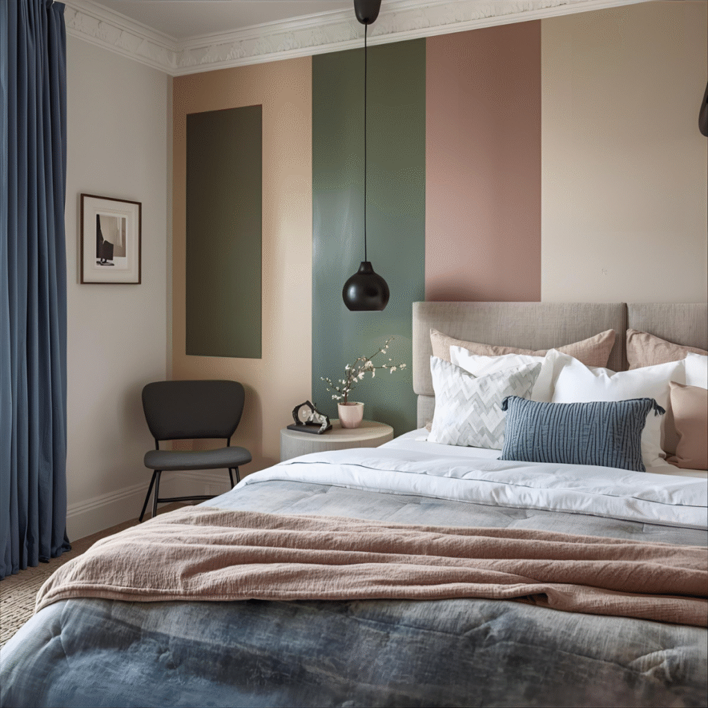
Expert Tips to Choose the Right Bedroom Color Combination
- Understand the Mood You Want:
Soft blues and greens for calmness, warm browns for coziness, or pastels for romance. - Test Before You Paint:
Check paint samples in daylight and night lighting; colors can appear different. - Balance Light and Dark Shades:
Too many dark tones can make your room feel smaller; mix them with light hues. - Follow the 60-30-10 Rule:
60% dominant color (walls), 30% secondary (furniture), and 10% accent (decor). - Add Textures and Patterns:
Combine smooth, rough, and soft finishes to create visual interest and warmth. - Think of Longevity: Choose colors you’ll love even after trends change—timeless combinations always win.
Your bedroom should be a reflection of your personality and peace. The right colors not only enhance beauty but also affect your mood, comfort, and energy. Whether you’re drawn to the serene blue and white, the romantic lavender and white, or the earthy terracotta and off-white, each combination carries its unique emotional and aesthetic benefit.
Design your space thoughtfully—mix textures, balance tones, and let the colors tell your story. A well-chosen bedroom color palette transforms your space into what it should truly be — your most peaceful and inspiring retreat.